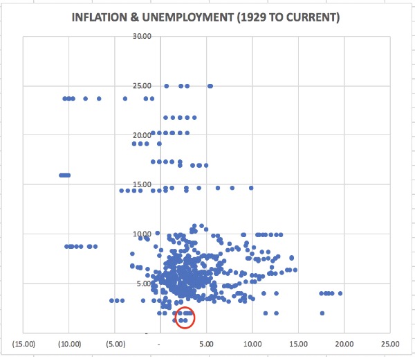
With the market volatility post the December Federal Reserve Open Market Committee meeting, we wanted to step back and consider the Fed’s mandate and stated objectives. Taking inflation and unemployment in the US, we analysed this monthly from 1929 to current which is the chart below (Unemployment Vertical, Inflation Horizontal).
We then looked at this to ask how well the Federal Reserve (or maybe the economy?) (or maybe what the market permits the Federal Reserve to do?) have achieved this in the past.
The little red circle is the sweet spot that the Federal Reserve is trying to hit. It looks pretty damm lonely to us. We believe to do this is going to require an extraordinary set of communication and messaging, coupled with highly skilled and a very active approach to Quantitative Tightening and Interest Rate hikes. If neither is present, or not in sync then we would expect to see increasing levels of asset class volatility in the coming year.
Interested to hear thoughts and observations, look forward to your input.